Services
1. Services Landing Page
Purpose: This page serves as the entry point for service-level observability.
Key Features:
- Displays a list of services with key performance indicators
- Columns include:
- Service Name: The name of the service being monitored
- P99, P90, P50 Latencies: Percentile-based response times for the service
- Operations per Second: The number of requests handled by the service per second
- Error Rate (%): The percentage of requests resulting in errors
- Users can sort the data in ascending or descending order by clicking on column headers
User Navigation
When a user clicks on a specific service, they are redirected to the service's Overview page.
2. Service Overview Page
The Overview Page provides detailed insights into the selected service's performance metrics and trends.
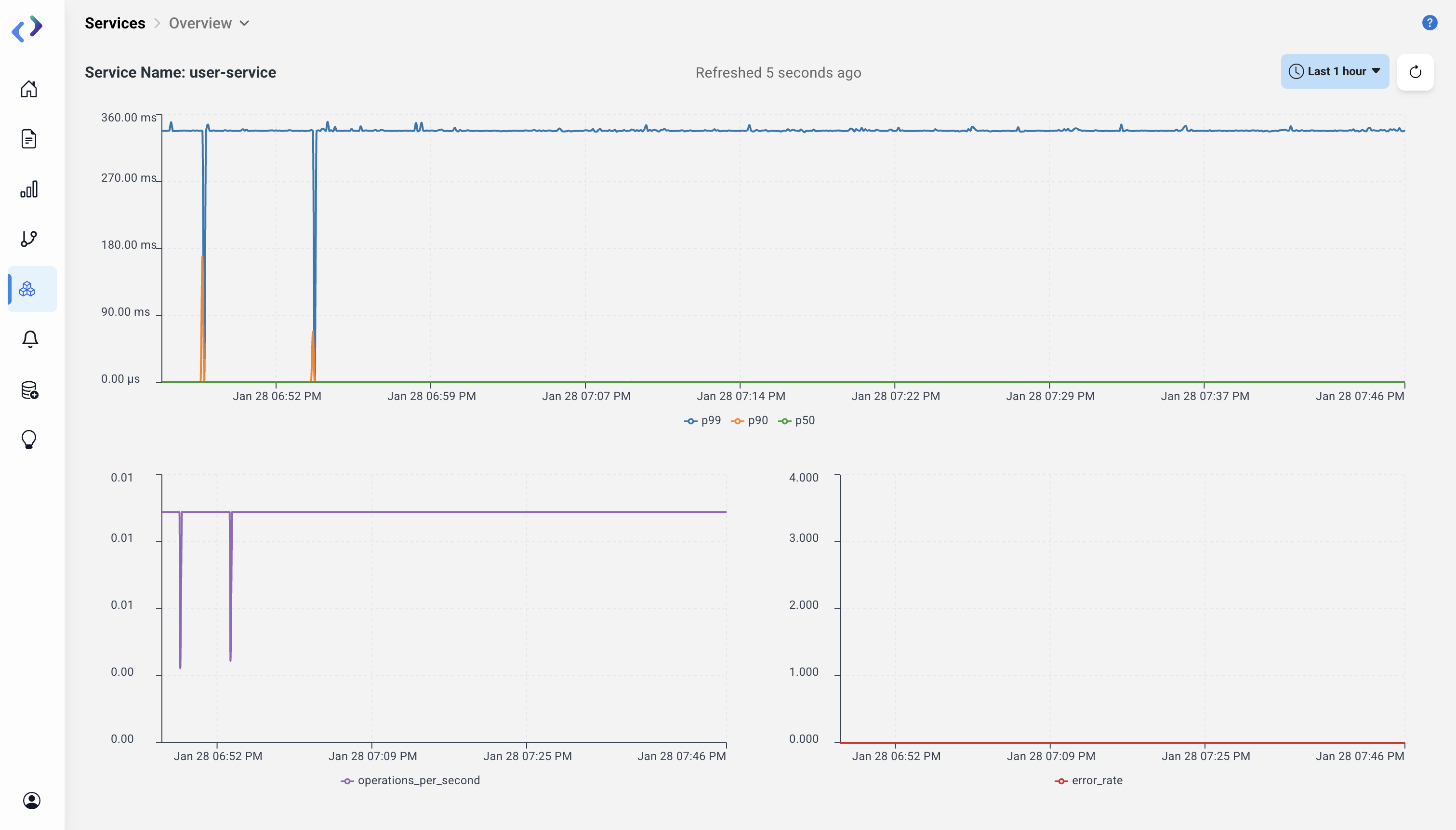
Key Components
- Latency Graph: Displays time-series data of P99, P90, and P50 latencies
- Operations per Second Graph: Shows the rate of requests handled over time
- Error Rate Graph: Indicates the percentage of requests that resulted in errors
User Interaction
The graphs update in real-time based on the selected time range (e.g., last 1 day, last 1 week).
Navigation
To view detailed operations, users can click on the Operations tab.
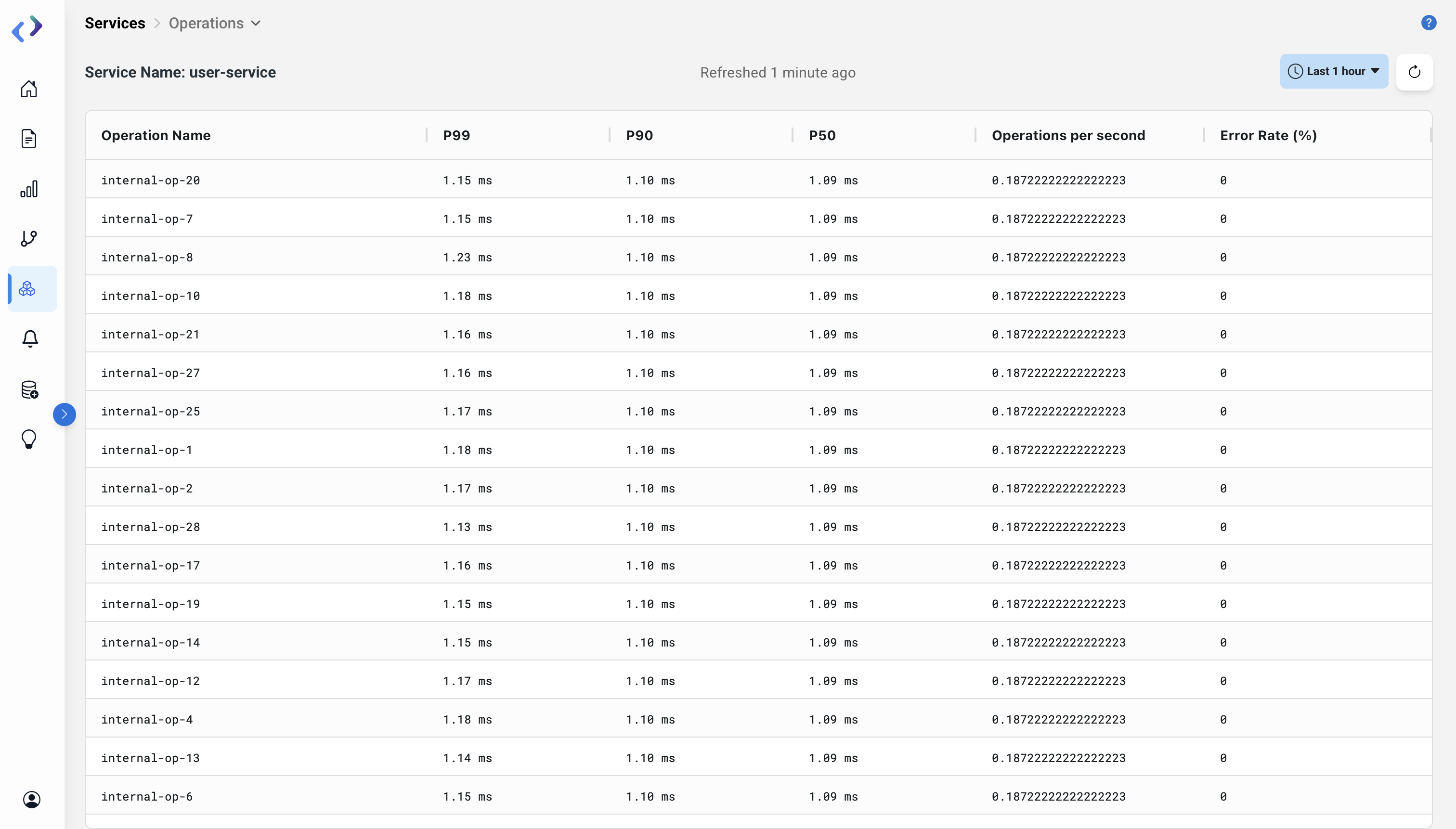
3. Operations Page
The Operations Page provides a breakdown of operations within the selected service.
Key Features
Span Table:
- Displays detailed metrics for each operation, including P99, P90, and P50 latencies, operations per second, and error rates
- Users can sort the columns (e.g., descending or ascending order) using the arrow icons
Metrics Explained
- P99, P90, P50: Response time percentiles for the operations
- Operations per Second: Number of requests of that particular operation type processed per second
- Error Rate (%): Percentage of requests of that particular operation type resulting in errors
Sorting and Filtering Options
- Sorting: Available for all metric columns (ascending/descending)
- Filtering: Available on the Trace Page to narrow down traces by time, operation, or error status
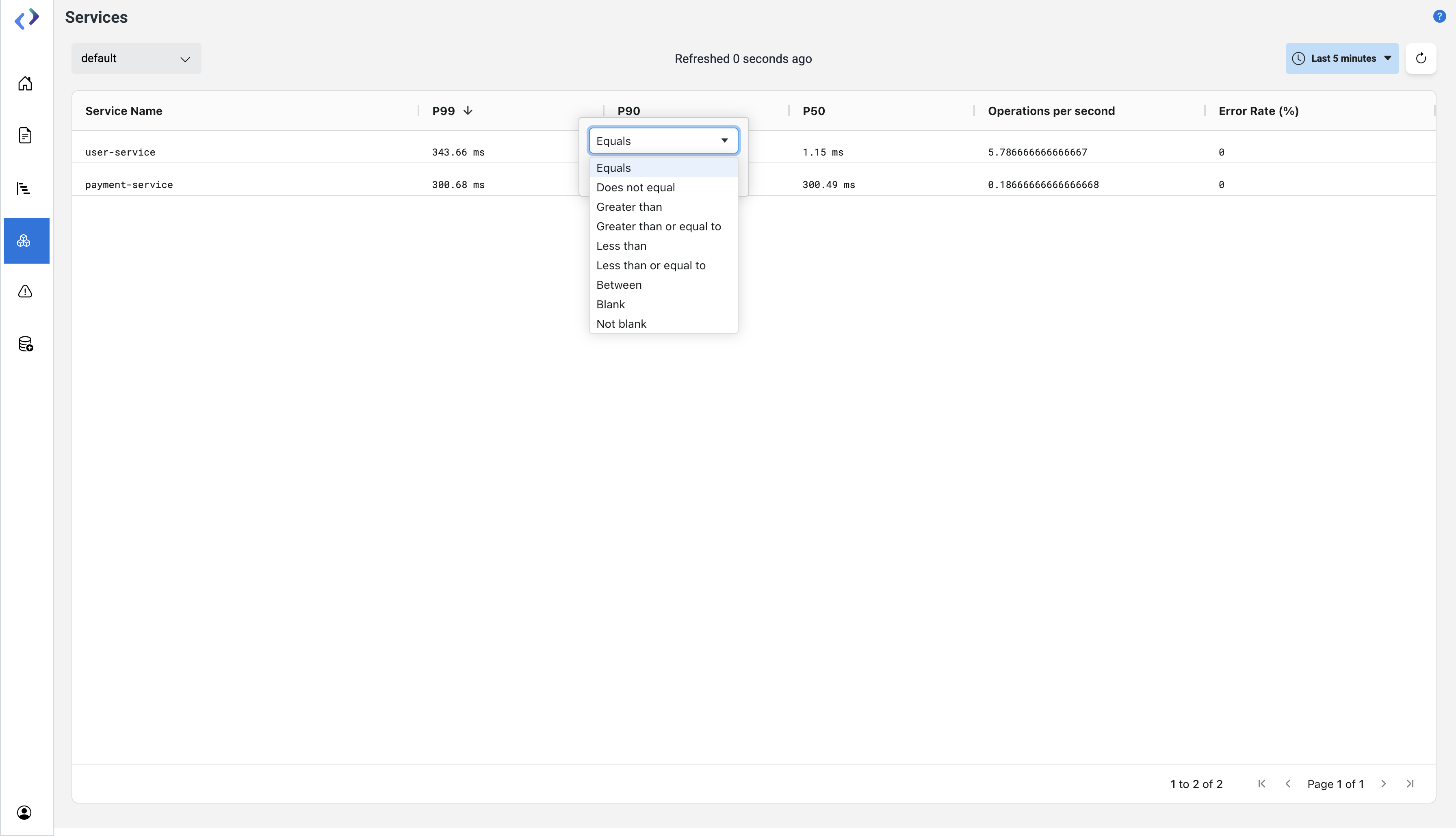 Add and Sort filter
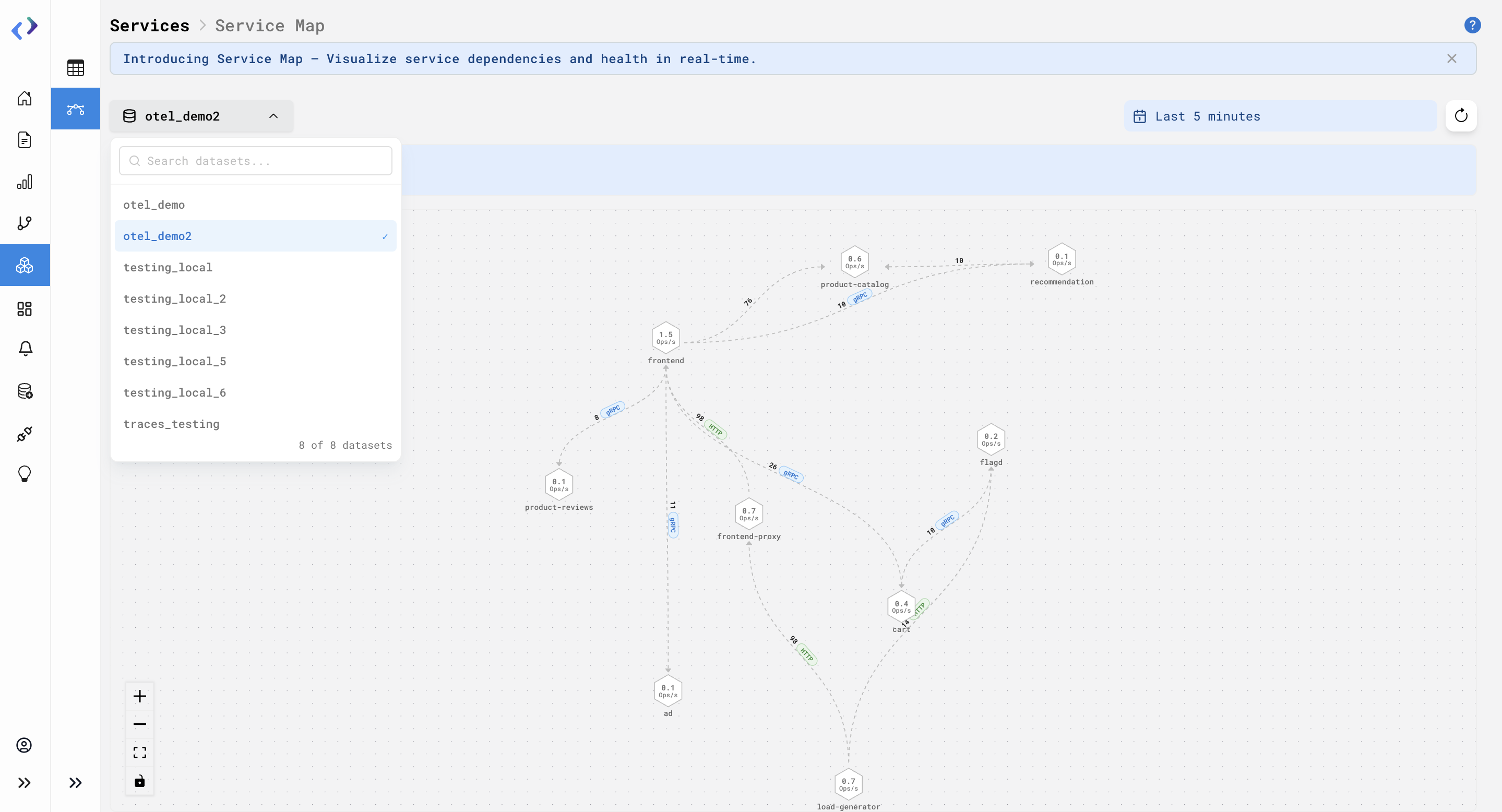
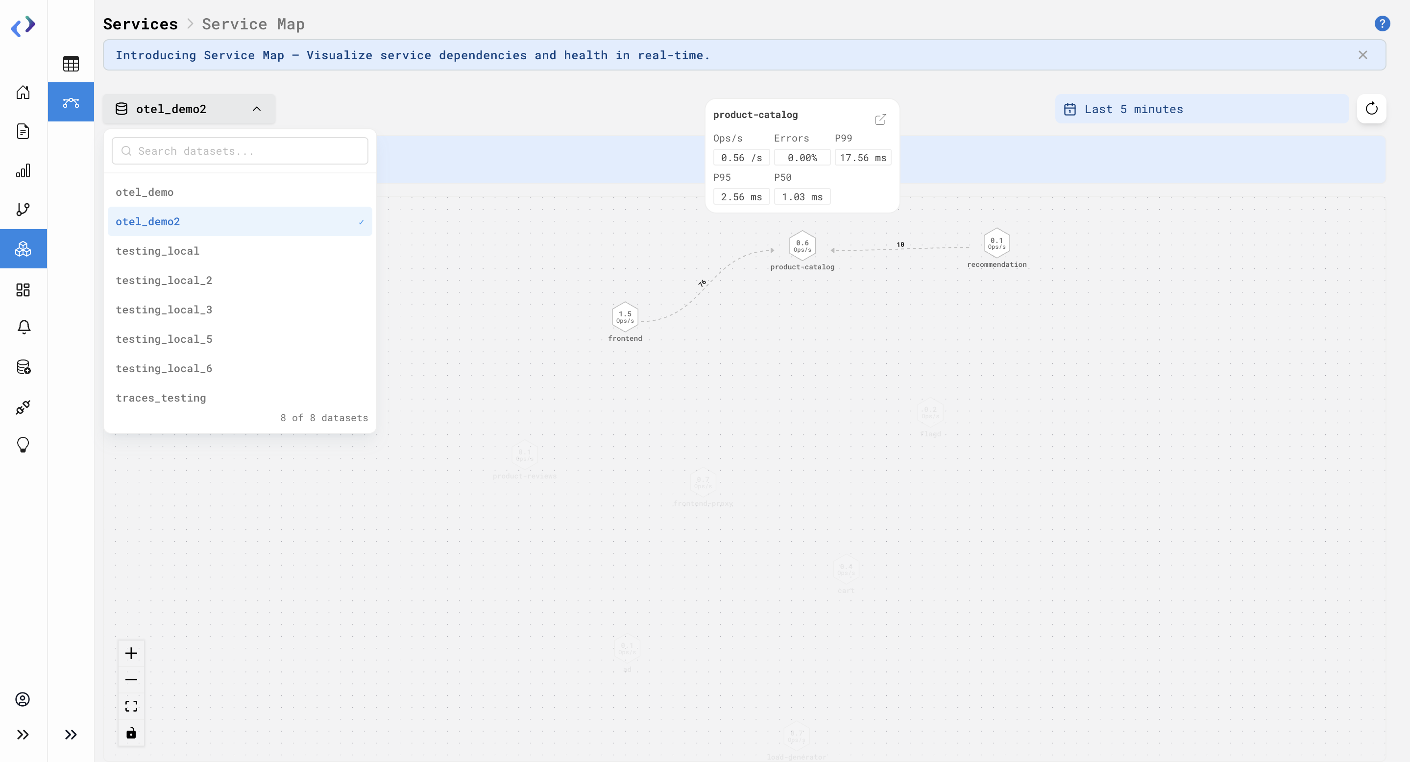
Service Map
Service Map provides a visual representation of how services interact with each other. It helps users understand service dependencies, monitor performance, and quickly identify issues across the system.
Steps to Use It:
-
Go to the Service page then select Service Map.
-
Select the desired dataset from the dataset dropdown (top-left). The map will update to show services and connections for the selected dataset.
-
Select the required time range from the time filter (top-right). All metrics like ops/s and call counts will update based on the selected time range.
-
View the service nodes on the map. Each node represents a service and displays its operations per second (ops/s).
-
Hover over a service node to view detailed metrics. The popup shows ops/s, error rate, and latency (P99, P95, P50).
-
Click on a service node and use the external link icon to navigate to the service Overview page.
-
Observe the connections between services. Connections show call direction, call count, and protocol (HTTP/gRPC).
-
On hovering over any particular node, it’s possible connections are highlighted.
Availability:
All users